Content Unfold
This lesson examines the Content-Unfold responsive design pattern, aimed at progressively revealing content to boost user interaction. We'll discuss how to implement this approach for a seamless, engaging experience on any device.
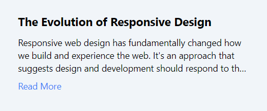
The "Content Unfold" design pattern is crucial for responsive web design, aiming to optimize content presentation on devices with limited display area, such as mobile phones. This strategy enhances the user experience by presenting information in a manageable, incremental fashion, preventing information overload by initially showing essential content followed by detailed information upon interaction.
This pattern is especially beneficial on mobile interfaces, where prioritizing content is vital due to the limited screen space. It employs CSS for styling content in its collapsed and expanded states, alongside JavaScript or frameworks like React for managing unfolding interactions.
Requirement
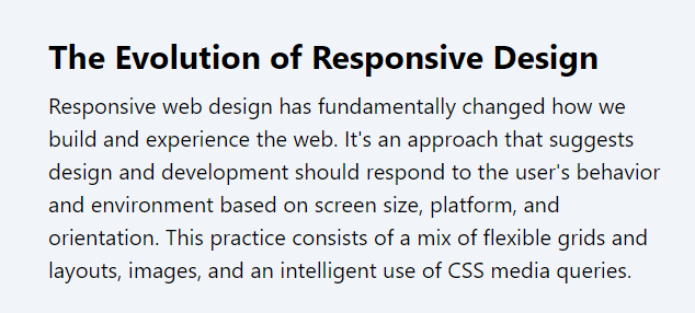
We aim to develop a component that previews an article excerpt on mobile devices, with a "Read More" option to reveal full content. On desktops, content appears in full by default, adhering to the Content Unfold pattern's objective of adapting content visibility to screen size.
Step 1: Set up the React component
Begin by creating a React component to manage the state of content visibility, toggling between the preview and full content based on user interaction.
Code block
<div className="p-4"> <div className="max-w-md mx-auto"> <h2 className="text-lg font-bold mb-2">The Evolution of Responsive Design</h2> <p className={`text-sm md:text-base ${!isExpanded ? 'line-clamp-3' : ''}`}> {"Responsive web design has fundamentally changed how we build and experience the web. It's an approach that suggests design and development should respond to the user's behavior and environment based on screen size, platform, and orientation. This practice consists of a mix of flexible grids and layouts, images, and an intelligent use of CSS media queries."} </p> {!isExpanded && ( <button onClick={toggleContent} className="text-blue-500 hover:text-blue-700 text-sm mt-2"> Read More </button> )} </div> </div>
Step 2: Add Tailwind CSS for medium breakpoint
Use Tailwind CSS's line-clamp-3 to limit article preview to three lines on smaller screens, and md:line-clamp-none for full content visibility on larger screens.
Encapsulate the "Read More" button within <div className='md:hidden'> to ensure it's visible only on small screens, seamlessly integrating the Content Unfold pattern by allowing users to control content expansion on mobile devices.
This component creates a responsive experience by initially showing a condensed version of the content on smaller screens with an option to "Read More." On larger screens, the full content is displayed by default, adhering to the Content Unfold design pattern's principles for improving usability and engagement across different devices.
Code block
<div className="p-4"> <div className="max-w-md mx-auto"> <h2 className="text-lg md:text-2xl font-bold mb-2">The Evolution of Responsive Design</h2> <p className={`text-sm md:text-base ${!isExpanded ? 'line-clamp-3' : ''} md:line-clamp-none`}> {"Responsive web design has fundamentally changed how we build and experience the web. It's an approach that suggests design and development should respond to the user's behavior and environment based on screen size, platform, and orientation. This practice consists of a mix of flexible grids and layouts, images, and an intelligent use of CSS media queries."} </p> <div className='md:hidden'> {!isExpanded && ( <button onClick={toggleContent} className="text-blue-500 hover:text-blue-700 text-sm mt-2"> Read More </button> )} </div> </div> </div>Mobile

Desktop

Conclusion:
The "Content Unfold" design pattern enhances mobile user engagement by presenting content in digestible amounts, with the option to expand for more details. This responsive strategy improves usability, ensuring a seamless experience across all devices. By prioritizing content visibility based on device size, it offers a streamlined, user-focused approach to web design, making information both accessible and engaging.
This lesson focuses on the Ghost-Loaders design pattern, detailing the use of placeholder animations to improve user experience by reducing perceived load times. We'll discuss strategies for integrating these loaders seamlessly into interfaces.
All Modules