Text Indent, Letter Spacing and Line Height Tailwind Classes
In this lesson, the focus is on exploring three specific typography-related utility classes provided by Tailwind CSS: Text Indent, Letter Spacing, and Line-Height. Together, these classes offer a comprehensive toolkit for refining the textual content of web pages, enhancing both usability and visual design.
Text Indent
The text-indent classes in Tailwind CSS are used to control the indentation of the first line in a block of text. These classes follow a consistent naming pattern, making it easy to apply the desired level of indentation. The naming convention typically starts with indent-, followed by a number that represents the size of the indent.
Here's a breakdown of the pattern used in these classes:
- Class Name: Begins with indent-, indicating it's a text-indent class.
- Number: Follows the indent- prefix, representing the magnitude of the indentation.
- Unit of Measurement: Tailwind uses rem units for most of these classes, with a few exceptions using px (pixels).
Let's look at some of these classes:
- indent-0: Sets the text indent to 0px, meaning there will be no indentation for the first line of the text.
- indent-px: Applies a small indent of 1px. This is a minimal indentation, barely noticeable.
- indent-0.5: This results in an indentation of 0.125rem (approximately 2px). It's slightly more noticeable than 1px.
- indent-1: Indents the text by 0.25rem (about 4px), useful for a subtle indentation effect.
- indent-1.5 through indent-64: These classes incrementally increase the indentation size. For example, indent-1.5 is 0.375rem (6px), and each subsequent class increases the indentation by a small, consistent amount.
- indent-72, indent-80, and indent-96: These are larger indent sizes, with indent-72 being 18rem, indent-80 as 20rem, and indent-96 as 24rem. These are used for very large indents, often in specific design contexts.
The pattern used in these classes makes it intuitive to select the right amount of indentation for your text. It's important to note that 1rem typically equals the font size of the root element (usually 16px in many browsers), making it easier to predict how the indent will appear across different devices and screen sizes.
Code block
<div className="mb-4"> <p className="indent-0">Design is not just what it looks like and feels like. Design is how it works. <span className="text-sm text-gray-500">(indent-0)</span></p> </div> <div className="mb-4"> <p className="indent-2">Design is not just what it looks like and feels like. Design is how it works. <span className="text-sm text-gray-500">(indent-2)</span></p> </div> <div className="mb-4"> <p className="indent-4">Design is not just what it looks like and feels like. Design is how it works.<span className="text-sm text-gray-500">(indent-4)</span></p> </div> <div className="mb-4"> <p className="indent-8">Design is not just what it looks like and feels like. Design is how it works. <span className="text-sm text-gray-500">(indent-8)</span></p> </div>
Letter Spacing
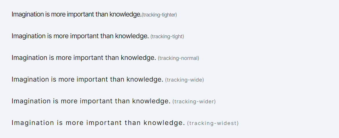
Letter-spacing in web design refers to the adjustment of the space between characters in a piece of text. It's a common CSS property used to enhance readability or create a specific visual effect. Lets look at the various classes provided by Tailwind.
- tracking-tighter: This class applies a letter-spacing of -0.05em. The negative value means it reduces the default spacing between characters, making them closer together than normal. This is often used for headlines or display text where a more compact text appearance is desired.
- tracking-tight: Slightly less compact than tracking-tighter, this class sets the letter-spacing to -0.025em. It's a subtle adjustment and can be used where you need the text to be a bit tighter but not too close to each other.
- tracking-normal: This class represents the default letter-spacing, which is 0em. It doesn't add extra space between characters nor does it reduce it. It's the standard spacing you'd see in most text without any additional letter-spacing adjustments.
- tracking-wide: This class increases the space between characters slightly, with a value of 0.025em. It's useful when you want to improve readability or create a particular stylistic effect, especially in shorter texts.
- tracking-wider: With a letter-spacing of 0.05em, this class makes the characters in a text element more spaced out than tracking-wide. It can be effective in headings or small blocks of text where you want to create a sense of openness.
- tracking-widest: This class sets the letter-spacing to 0.1em, creating the most spaced-out effect among the classes you listed. It's quite noticeable and is often used for stylistic emphasis, in large headings, or in areas where you want the text to stand out.
Code block
<div className="mb-4"> <p className="tracking-tighter text-lg">Imagination is more important than knowledge.<span className="text-sm text-gray-500">(tracking-tighter)</span></p> </div> <div className="mb-4"> <p className="tracking-tight text-lg">Imagination is more important than knowledge.<span className="text-sm text-gray-500 ml-1">(tracking-tight)</span></p> </div> <div className="mb-4"> <p className="tracking-normal text-lg">Imagination is more important than knowledge.<span className="text-sm text-gray-500 ml-1">(tracking-normal)</span></p> </div> <div className="mb-4"> <p className="tracking-wide text-lg">Imagination is more important than knowledge.<span className="text-sm text-gray-500 ml-1">(tracking-wide)</span></p> </div> <div className="mb-4"> <p className="tracking-wider text-lg">Imagination is more important than knowledge.<span className="text-sm text-gray-500 ml-1">(tracking-wider)</span></p> </div> <div className="mb-4"> <p className="tracking-widest text-lg">Imagination is more important than knowledge.<span className="text-sm text-gray-500 ml-1">(tracking-widest)</span></p> </div>
Line Height
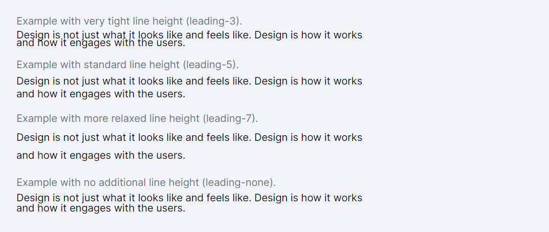
Line height affects how lines of text are spaced apart from each other, which is crucial for readability and the overall aesthetic of the text on a web page. Adequate spacing between lines can make a block of text easier and more comfortable to read.
Tailwind CSS provides a set of utility classes for setting line-height that follow a naming convention: leading-[value]. These classes make it easy to apply consistent and responsive spacing between lines of text across your application. Here's an explanation of the classes you mentioned:
- leading-3 to leading-10: These classes set fixed line-height values, ranging from .75rem (approximately 12px) to 2.5rem (approximately 40px). Each class number in the name corresponds to the line height in rem units. For example, leading-3 sets a line height of .75rem, and leading-10 sets it to 2.5rem.
- leading-none: Sets line-height to 1, meaning no additional space above or below the line, resulting in a line height equal to the font size.
- leading-tight, leading-snug, leading-normal, leading-relaxed, leading-loose: These classes provide more descriptive options for setting line-height. They offer a range from tight (1.25) to loose (2), allowing for finer control over the spacing between lines. leading-normal is typically equivalent to the default line height of 1.5.
When to Use Line Height Classes
- Paragraphs and Longer Text: For body text or paragraphs, a good line height helps improve readability. The leading-normal or leading-relaxed classes are often suitable here.
- Headings and Titles: With headings, which typically use larger font sizes, you might want a tighter line height (like leading-tight or leading-snug) to keep the heading compact and impactful.
- User Interface Components: In UI components like buttons, where text is usually shorter (one or two words), you can use line height (often equal to the button’s height) to vertically center the text.
- Responsive Design: In responsive design, as the font size changes at different breakpoints, adjusting the line height accordingly can help maintain text readability and layout consistency across devices.
Code block
<div className="mb-4"> <p className="text-gray-500 mb-1">Example with very tight line height (leading-3).</p> <p className="leading-3">Design is not just what it looks like and feels like. Design is how it works and how it engages with the users.</p> </div> <div className="mb-4"> <p className="text-gray-500 mb-1">Example with standard line height (leading-5).</p> <p className="leading-5">Design is not just what it looks like and feels like. Design is how it works and how it engages with the users.</p> </div> <div className="mb-4"> <p className="text-gray-500 mb-1">Example with more relaxed line height (leading-7).</p> <p className="leading-7">Design is not just what it looks like and feels like. Design is how it works and how it engages with the users.</p> </div> <div className="mb-4"> <p className="text-gray-500 mb-1">Example with no additional line height (leading-none).</p> <p className="leading-none">Design is not just what it looks like and feels like. Design is how it works and how it engages with the users.</p> </div>
In this lesson, the focus will be on exploring Tailwind CSS's font-smoothing classes, which are designed to enhance text readability and appearance on various screens.
All Modules